 Walk Fresh
Walk Fresh’s logo is effective in terms of colouring. Although, The typography seems too corporate and doesn’t scream modern and clean. Furthermore, the shoe-prints in the corner of this logo removes a lot of quality within the logo. The greyscale, ink styled colouring of the prints make the business look un-professional and out-dated.
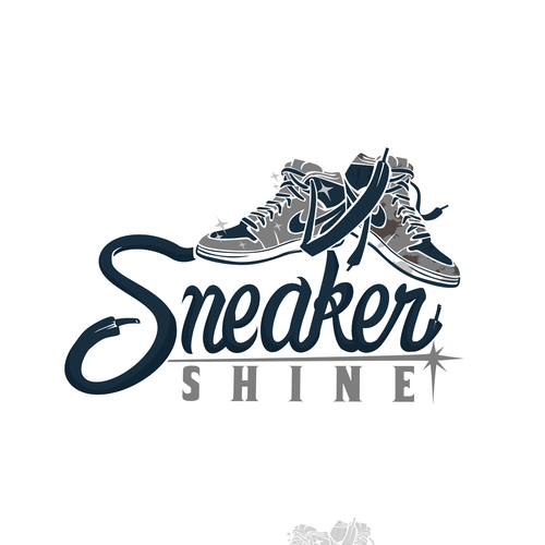
Sneaker Shine
Sneaker Shine’s logo straight away looks much more modern and unique compared to the previous logo. Although it still carries, in my opinion, many flaws. One of these being, the vast difference in choice of font and type styling. The use of an industrial looking serif font paired with the modern and abstract title typeface makes this logo look un-professional. This is because these 2 typefaces do not mix well together and the word “Shine” seems like it doesn’t belong in the logo. My second flaw with this logo is the colour scheme. They are a sneaker CLEANING business, yet they have chosen very dull, dirty and boring colours to represent their brand. Dull colours make it very hard to become connected with a business or brand.
 The Sneaker Laundry
The Sneaker Laundry’s logo fits a lot better to the style I would associate with a cleaning business. Although still possessing minimal flaws, I like the overall simplicity and minimalism of the logo. The 2 most apparent flaws for me are that the logo does not flow. The pointing shapes above and below the text limit the amount of freedom and flow this logo can have. These shapes restrict the word’s “Sneaker” ability to flow. The way I see it is that no matter where you position this logo, it will never seem as though it is in the middle or centred. This is a good way to check if your logo has flowing look. A simple way to fix this would be to remove upper and lower shapes encasing the typography to allow the word “Sneaker” to be the staple point of the logo.
Some things to keep in mind…
- Ensure your logo flows… no restricting or unnecessary shapes.
- Abstract, unique and partnering colours… your colours need to compliment each other.
- Be aware of the secondary typography you use… make sure your secondary typography compliments your main type choice/design as this is critical to the story and vibe your logo delivers to the audience.
